HCI Laundry Project
Interviews, Axial Coding, Figma Prototype, and UX Evaluation
Teammates on this project:
Eva Cao, Stella Thompson, and Harry Xun
Goals of our project:
The main goal for our project was to design an interface for an app that would help students on the Carleton campus navigate dorm laundry facilities with ease. Hopefully creating a less stressful experience while also keeping the facilities cleaner by promoting less clothing left and lost within the laundry rooms.
First Figma Prototype:
Created Individually.
How this prototype addresses user needs:
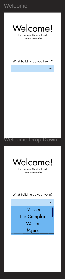
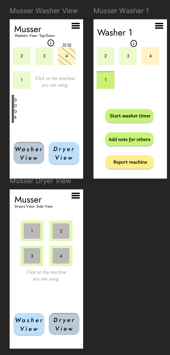
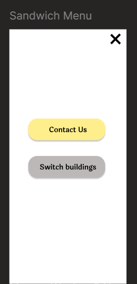
- Able to see which machines are in use/avalible.
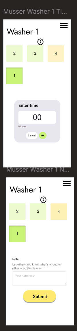
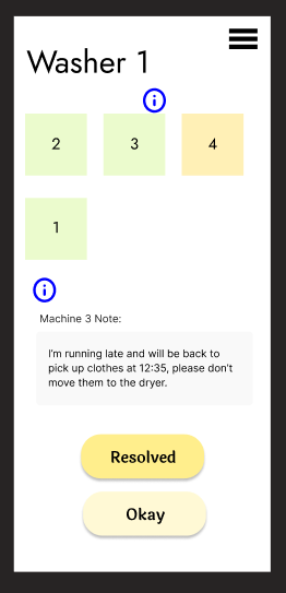
- Able to mark timer on machine or leave a note for others.
- Reporting a broken machine is easily accessible.
Updated Figma Prototype:
Our teams requirments for this design:
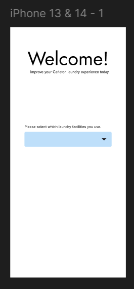
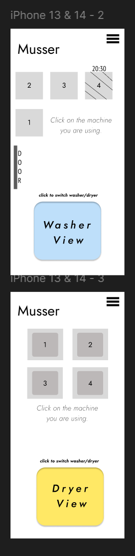
- Ability to view avalible machines.
- We want users to be able to know through our interface what machines are currently avalible.
- Once a building is selcted unavalible machines are crossed out with a timer indicating when the cycle will end. Other machines should be clickable to click.
- Laundry status tracking.
- Users should have the ablity to track their laundry status within the app.
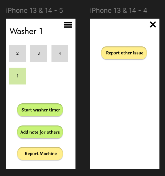
- Once an avalible machine is selected, an option to set a timer to show how much time your laundry will be in the machine.
- Avoiding conflicts/issues.
- To best avoid conflict, users should have options to comunicate with others using the app and laundry rooms.
- The ability to mark down notes for others or report a machine as unavalible help users avoid conflicts over laundry machine use or placement/removal of clothes. Note: Reporting machines would link to Carleton's report form (external) and is not included in the interaction flow.
Link to interaction flow to try it yourself!
Our Research Process:
Our UX process that helped inform our invidual designs was a collaborative process. We each conducted interviews on our own. Collectivly we conducting five interviews: three fictional inquiry (more design focused) and two semi-structured interviews (more experience focused). Both informed our design in diffrent ways by asking our participants about they're previous experiences and prefrences for a hypothetical laundry tracking application.
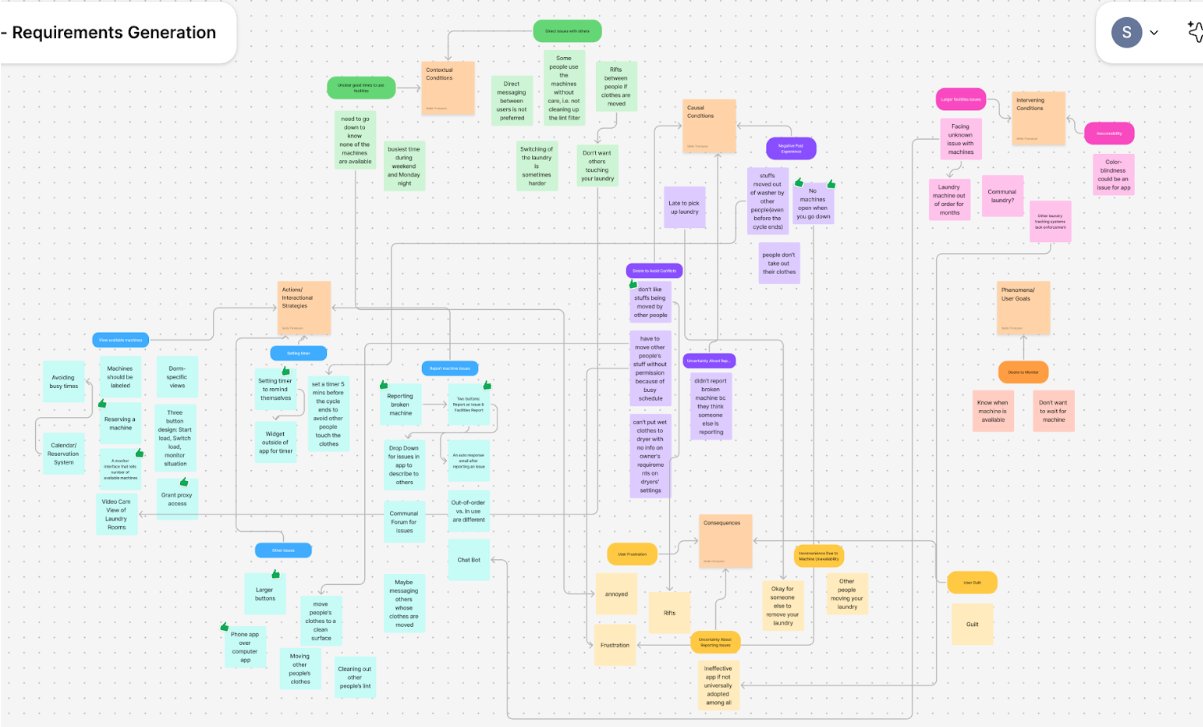
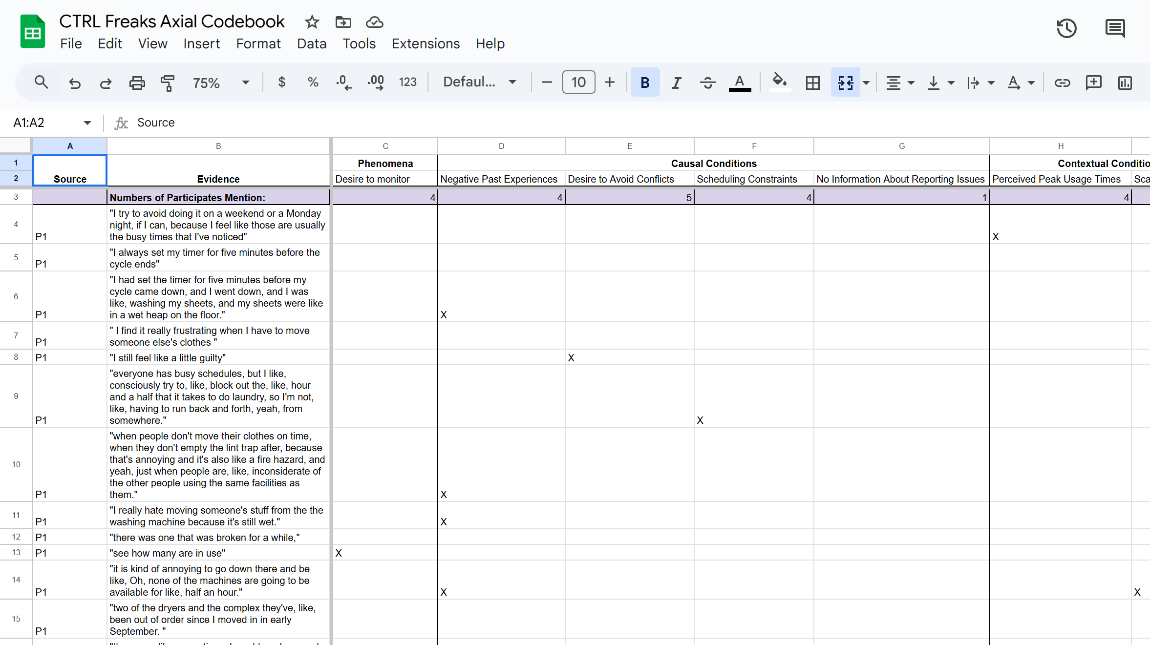
After this process we read through the transcripts and started looking for codes of what our participants were experincing and what they would desire from an interface for this application. We used a FigJam to help us sort out these ideas intially. After analyzing all the transcripts with codes individually we made a consensus tab in our code book to sort through our priorites and figure what our collective understanding of the requirements statements that we would make for our project.
FigJam:
Consensus in our Codebook:
UX Evaluation:
Main takeaways from my co-discovery session:
- The overall flow was liked by the testers but parts of the interface were not as intuitive.
- Users thought adding more colors or a key to distinguish between machine status would be helpful.
- Users also wanted a way to know if machines has a note attached to them.
What I changed about my prototype:
- The washer/dryer view button was split into two buttons to clarify what view users where on.
- Colors to distinguish between avalible, selected, and in-use machines were added.
- An info button for notes was added to machines with a note.
Final Figma Prototype:
Created Individually.